Are you worried about the impact of a low conversion rate on your eCommerce site?
You are an online business owner and the conversion rate of your site is low and you want to know the reason why. Before going to the factors that make your conversion rate low, it is important to understand clearly what Conversion Rate is.
Conversion Rate is the percentage of visitors to your website that complete a desired goal out of the total number of visitors. This is an effective method for the sellers to figure out the number of customers access to their website and who certainly buy their products. The higher conversion rate you get, the more success you can achieve.
Having said that, achieving a high conversion rate is not a piece of cake. That’s why it requires business owners to understand the mistakes that contribute to the low conversion rate. Let’s discover the 7+ Reasons & Product Solutions For Low Conversion Rate below to find the cause and the solution for the problem.
1. Your website is not mobile friendly
Beautiful laid out landing page but not translate well to smartphones and tablets?
You are missing a very important factor to boost your e-commerce conversion rate.
Nowadays, with the boom of technology, especially with the smartphone industry, there are more and more smartphone users. Therefore, mobile users are now becoming the most potential customers for online shop owners, so if your website isn’t fully responsive to mobile users, they will leave your site for another site.
 Furthermore, mobile friendliness is now one of the most important factors in ranking for Google, so test your website frequently on a variety of devices and mobile web browsers.
When you’re successful in mobile, manage your website to look more beautiful in multiple browsers as well so that your customers’ experience is the same.
And the typical examples for eCommerce shopping websites that have been succeeded in this mobile friendliness part are eBay, Amazon, etc.
The product can support your eCommerce web: Magento 2 Marketplace extension
2. The image quality of products is poor
Many people in general and marketers, in particular, believe that “though content is the king, a picture is worth a thousand words”.

Nowadays, users prefer just to see a great picture rather than being told exactly a product with two paragraphs of copy and low-quality pictures. Tiny, grain and wrong file size are things that you need to avoid on any devices as they can slow your loading page. Additionally, choosing poor quality pictures also decrease SEO’s value and increase the bounce rate. This results in decreasing user engagement as users won’t stay on your page long enough to see your content or product and more terrible that they won’t visit the website again. It should be better if you use the sery of impressive images as a tool to tell the story of product and explain the services of your business offers by providing easy-to-scan information.
The product can support your web image quality: Magento 2 Image Gallery
3. You have not focused on conversion rates
As an online store owner, you may be focusing too much on making changes to your landing pages on a whim, while forgetting all of the other aspects of your business.

However, this multitasking approach can make your conversion rate plan distracted and have no time to implement changes effectively. Sometimes you will find it hard to find out as there is a handful of changes here and there.
Outsourcing landing page might be right for you if you are doing it on your own. Even when having a full team behind you, if there is nobody committed to increasing conversion rates and optimizing web pages, your efforts won’t be effective as that would.
Keep reminding everyone about how effective the conversion rate performance can bring to your business while giving each person the primary task of improving conversions as their daily work.
4. Customers don’t believe enough with your landing pages
Not always are customers ready to hand over their credit card when they visit your page. You have to persuade them that only your business is the right choice for them to provide products and services that they need.
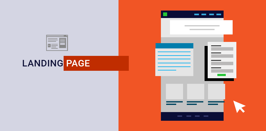
All you need is a clear, persuasive website copy as well as a clear call-to-action that enforces your visitor to explore.
5. Your form is too long or complicated
Sometimes you will need a wide range of data for multiple purposes, they are part of everyday life! Sometimes you will need to create a form might be used for a personal application or to take customer details for account setup.
Yet, you can not provide your customers with long questions with an amount of information unless it’s really necessary.
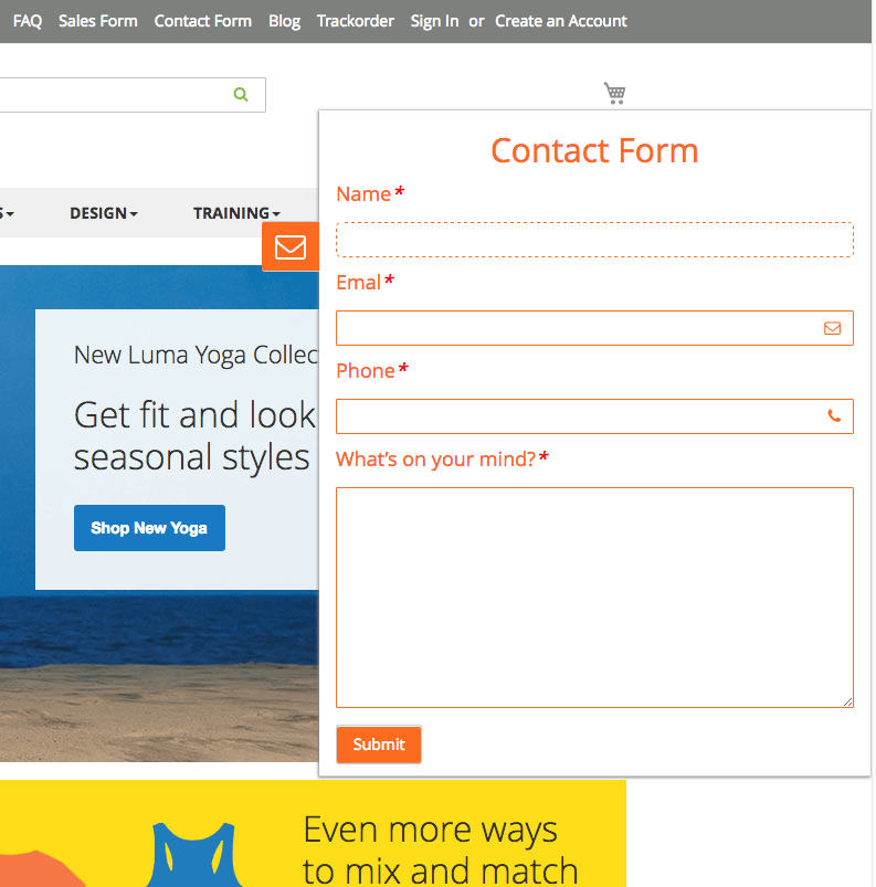
A web form can be added into any landing page on your website to capture visitor details. This can increase the risk that the visitors will get bored or feel too much trouble to complete or even leave your site without giving any details.
If you need to include multiple fields, remember not to make them required information.
The product can support you in building form: Magento 2 Form Builder
6. Your menu makes a bad first impression
While accessing one website, customers use the menu as one of the necessary tools to search and explore products having in the store. However, some handful of navigation elements lead the users confused at times as they don’t know which one goes straight to another page. Even some menu items with dozens of product and menus make the website’s visitors feel confused.
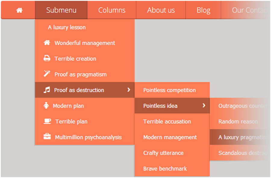
If the menu is hidden, all of the keyword that users are looking for disappear as well, they will choose to ignore your page because it’s time-consuming and hard to understand. Make menu task easy to find, by featuring a few of them on your sales page and having the rest under.
The product can support your website menu bar: Magento 2 Mega Menu
7. Your checkout process is too difficult
For an online shopping store, customers want a clean and effective checkout process. This means they don’t want to jump through a number of steps to complete their purchase or they will abandon their carts and shop at your competitor instead.
Remember to make the process as simple as possible, minimize interruptions that can prevent them from finishing the process. Test the shopping process by yourself at first to make sure there is no technical errors or bugs that can disrupt clients.
If there is any error while customers are shopping, consider giving them a cancel page. It gives them the opportunity to save their cart for later, continue to check out or a live chat with the customer team, which will capture potential clients.
The product can speed the checkout process: Magento 2 Onestep Checkout
Final words
This is the 7+ Reasons & Product Solutions For Low Conversion Rate. Hope that you will find out the solution for your e-store and boost your sales up. Once you have a better understanding of factors that influence conversion rates, you can attract more potential customers and push your website to a higher level.
